The Challenge
Access and share business-sensitive information from disparate sources from across the internet.
The goal was to go beyond screen sharing and email attachments. Could users truly co-work on business documents from different systems? As the information was being shared, we also didn’t want to leave behind duplicates. Versioning is just a hassle, and the duplicates left behind are just a security risk. How could we empower users and make sharing of information easier, transparent, and above all, secure?
Through discussions with customers, we knew the need was there. For example, sales teams need to share information all the time, and not necessarily within their own organization. Of course, they don’t want to share everything – just the info that can help close the deal, or inform partners of opportunities.
The Vision
We wanted to provide a powerful, easy to use app that would allow access to business information quickly. Support for multiple form factors was also key. Users could share, hide, and un-share with anyone at any time. Information seen would always be up-to-date, and edits could be reverted by owners at anytime.
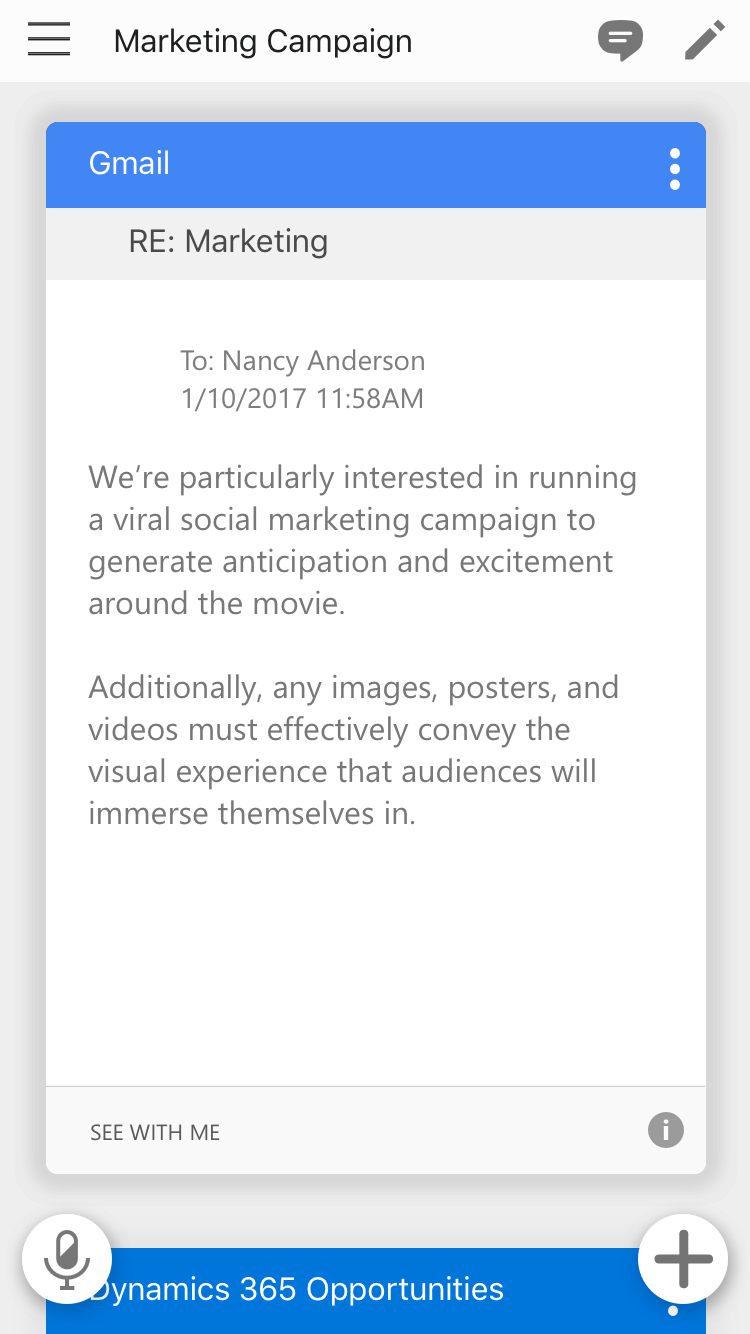
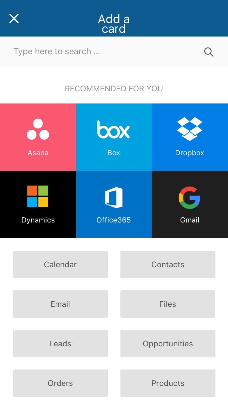
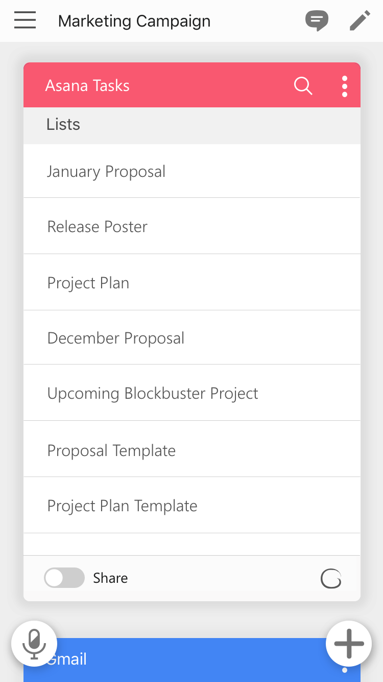
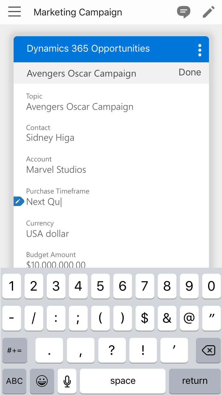
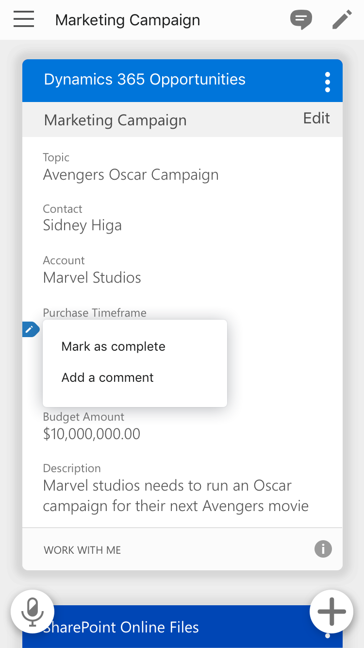
Many paradigms were explored, and over time it settled on a canvas with a flexible card system. Each canvas represented a shared space, and each card held information live-linked to a service. Information within each card could be hidden ad-hoc, and services could be added or removed as the work requirements changed over time. The card system also allowed us to build on multiple form factors without too much accommodation.
GigJam On The Go
To enable access and sharing as broadly as possible, we delivered on all major platforms.
Refinement
The team began with just six people. In the beginning, I acted as UX, UI, motion, art director – whatever was needed from the design side of things. As the product gained traction, I was able to grow the design team to over ten talented individuals. We worked hard to iterate and refine GigJam in an ever-changing production environment.
UX Research
The frantic pace of ideation and production created a disconnect between the working code and goals of the design team. I brought UX research on board as quickly as possible to cut through the political and technical noise. Testing became an important tool to help reign in feature creep and focus importance on UX issues during sprints. The UX researchers brought clarity to trouble spots and gave designers the much needed data necessary to tackle some of the more difficult challenges.
Looking Ahead
As we pass the MVP milestone, I am encouraging the entire design team to spend even more time looking ahead at what’s possible. Leveraging the research data, customer feedback, and our own ideas and ambitions – I’m looking forward to seeing how this app evolves.


